One map style that many people ask about is the bivariate map. While QGIS doesn't provide a perfect solution, it does offer some possibilities. One option is to use blending modes to lighten or darken a layer based on a quantity. This works particularly well when one data variable is categorical and the other is an amount.
Here, we'll use color to show crime type and then apply a fading effect so that older crimes appear less prominent. For the second part, we'll need a field containing "age" of each crime. Since the crimes are recorded from Aug. 2014 to Aug. 2015, we'll use Sep. 2015 as a baseline and calculate the time elapsed from the date of the crime:
1. Calculate Age Field
First, use field calculator to calculate a new age field. Use the following formula:
12*2015+9 - (12* "Year" + "Month" )
The first part (12*2015+9) is a month index value for the baseline date (equal to the number of months elapsed since 0 AD), and the second part subtracts the month index value for the crime. The difference is the number of months elapsed between the crime and Sep. 2015.
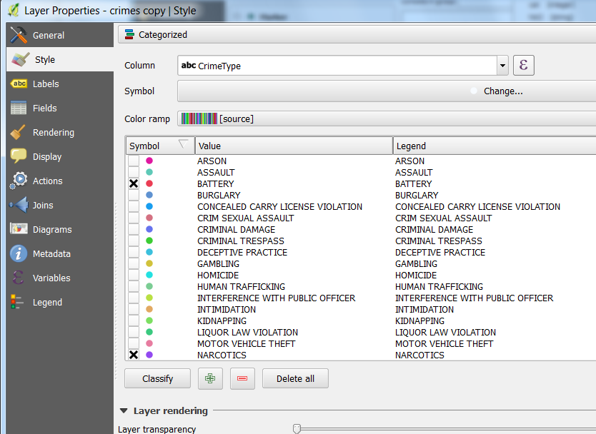
2. Create categorized symbols for narcotics and battery.
- At top, select Categorized
- For Column, select CrimeType
- Click Classify
- Uncheck all boxes except BATTERY and NARCOTICS
- Make colors distinct (e.g. red & blue)
- Remove the outlines around each point symbol so only the fill color shows

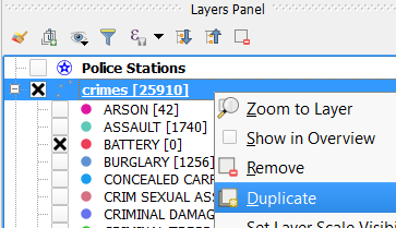
3. Back in the Layers Panel, duplicate the crimes layer (right-click >> Duplicate)

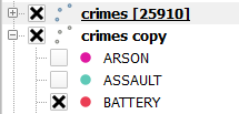
The duplicated layer will appear below the first layer as a "copy". Check the box next to the copy layer so they both are visible:

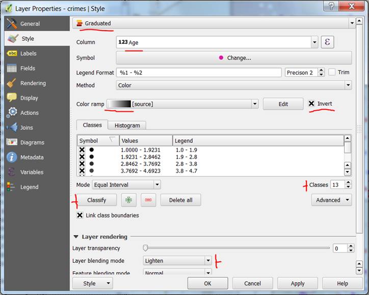
4. We'll now set the blending mode for the top layer. Go into the symbology for the top layer and change to graduated by age, as shown here:

- At the very top, select Graduated
- For the column, select Age
- For the color ramp, select the grayscale (white to black)
- Check the Invert box
- Increase the number of classes to 13
- Click Classify
- Under Layer Rendering, change Layer blending mode to Lighten
Click OK. You should see something like this:

The newer crimes appear as normal, and the older crimes are faded.
In the next section, we'll explore another commonly requested map type, heat maps.